2013-08-14
intersect.husk.org - a writeup
Ever since Twitter hid at-replies from people who weren't mutual followers, I've had cause to wonder how many people are seeing the conversations I seem to be taking part in.
I remember, even just a couple of years ago, there being a few web sites that let you put in two usernames and see who was following both, but there are two problems with that:
- They were usually really badly designed
- I couldn't find any of them recently
- they never did seem to like the fact that my main account is protected
That being the case, I thought it'd be a good little project to hack on. Fetching and calculating the overlap was pretty straightforward, and I had the idea that I'd like to represent the followers of both users, along with their overlaps, with a Venn diagram. It wasn't too hard to get this drawing with d3, but it took a while to completely straighten out all of the maths.
Once I had the app up and running, I found the real reason there probably aren't any of these services any more: Twitter's API rate limits. In particular, intersect makes a lot of use of the /follower/ids call - understandably, since the whole point is the overlap of followers - which gets 5,000 followers at a time, but is limited to 15 calls per 15 minute window.
What does this mean for a user? Well, if you're following normal-ish people, then you can only look up a few of them every quarter of an hour. After that, the app echoes the error Twitter returns: 'rate limit exceeded'. If you try someone with hundreds of thousands of followers, the app will just fail.
I've thought about putting in a counter, either raw or as a percentage, and also of detecting users who'd require more than a few calls to /followers/ids/ and refusing to work for them. (Alternatively, I could only consider their most recent ten thousand users. I may yet do that.)
For now, though, I seem to have reached a point where I'm happy to stop writing code, finish this write-up, and let the app hang out on Heroku for as long as it wants. If you're curious about the code, it's on Github. Meanwhile, I can happily check that when I have a spirited conversation with @whoisdanw, only sixteen people are likely to be subjected to it.
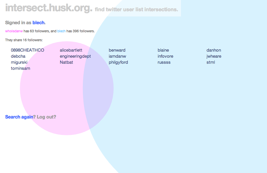
(Oh, and thanks to Fiona Miller, who did some sterling work on colours, as well as thinking through user interactions, and Tom Insam, who came up with the good idea of colouring the users to match the circles representing their follower counts. They were invaluable in making the site look lovely.)
2012-04-02
A Fuller Review- Bucky and the Bay Area
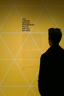
This weekend saw the public opening of The Utopian Impulse: Buckminster Fuller and the Bay Area at SFMOMA, the city's modern and contemporary art museum. I thought I should pop in and have a look.
 SFMOMA is (still) the only museum here I'm a member of. It's downtown, it has a heavy focus on photography (one of my favourite visual forms), and shows some interesting contemporary art. It also features a couple of rooms that tend to be dedicated to design, and it's these that host The Utopian Impulse.
The entrance and first room are dedicated to Buckminster Fuller's work, with a large Dymaxion map - his design for a world map that's based on an unfolded icosahedron (or cubeoctahedron, although those aren't represented here) to minimise the distortions inherent in displaying a sphere on a flat surface - along with Inventions: Twelve Around One, a series of prints by Chuck Byrne that fuse diagrams and sketches with photographs of Fuller and his inventions. There's also a shelf of the designer's¹ books, along with a display table featuring such lesser-known images as one of his Tetrahedral City proposal, a vast polyhedra situated in the San Francisco Bay.
There's not much new here, though, if you're already aware of Fuller's work. The much larger second room is, by contrast, dedicated to the Bay Area artists, designers, architects, and inventors who've been inspired by it. Here you'll find video, models, artworks, and products from the Ant Farm's proposals for a Convention City, Whole Earth Catalogs, the North Face Oval Intention tent, Nicholas de Monchaux's Local Code, the One Laptop Per Child project, and various models and designs for buildings both built and unbuilt.
It's definitely interesting (and slightly overwhelming) to see how this region has developed his ideas, even if some of the connections seem a little tenuous and could do with further explanation. The final (small) corridor, showing interviews and images from the Dymaxion Chronofile projected onto a custom-designed flattened icosahedral screen, helps somewhat to make the links more explicit; one segment I saw featured Stewart Brand and his "why haven't we seen a picture of the whole earth" campaign, for example. It's also, frankly, a rather amazing piece of AV sculpture.
Would I recommend the exhibition? If you're already in San Francisco or plan to be, and especially if you have a friend who can get you into the museum, then yes, it's well worth a look. However, it's small enough that I really can't suggest anyone travel here. It also makes much more of the Bay Area links than it does provide an overview of Buckminster Fuller's work. Comparing it to the photos and description of the Whitney's show in 2008, it's really just an amuse bouche. It's also a shame, because for all that this work is worth looking at, it doesn't fascinate the same way Fuller's designs themselves do.
Further reading: the exhibition press release is the museum's own summary of the show. I've also uploaded some photos to Flickr. The exhibition closes on 29th July, 2012.
¹ One of the problems with Buckminster Fuller is finding a word to describe him. The Whitney uses "visionary", which is probably right, but for some reason I can't quite bring myself to write that. "Designer" is perhaps not enough either, but I'm more comfortable with it.↩
2012-03-27
More Thoughts On Pagination
For the last month or so, Flickr have been starting to roll out their new "justified" view across the site. It's very pretty, and generally I'm a fan, but as well as the possible criticism of the reliance on JavaScript,¹ it's meant that the easy access to page numbering on the old views has been lost. An off-the-cuff (and admittedly somewhat snarky) remark on Twitter prompted Nolan Caudill to write a well-thought-out post about pagination.
In it, he agreed with my point about infinite scrolling:
Infinite scrolling is basically a pretty representation of the 'next' link that you 'click' by scrolling to the bottom of a page. I'll leave whether or not it's good user experience to others, but as a purely visual experience, I like it. If it's the only source of pagination, that sucks, and another navigation scheme should be provided if having your users be able to look through the list or find something is important.
but he also made a very good point about the failings of traditional "n per page" links:
Pagination should provide accurate navigation points that reflect the overall ordering of the stream, and pagination based around fixed-length pages provide nothing more than arbitrary access into this ordering, where we have to use estimation and instinct about the distribution of the content in order to make a guess of where a link will send us
He goes on to suggest time-based navigation, somewhat like the letter tabs often found in dictionaries. In fact, many sites already implement their APIs this way- Flickr included. Twitter makes copious use of max_id (and this is well-explained in their documentation), while Instagram use max_timestamp and min_timestamp. There are places in the Flickr API that can use min_timestamp and max_timestamp, although there are also traditional page parameters in that call.
It's not just APIs, though. Tumblr's archives are infinite-scroll, but with a month selector so you can skip back and forth through time. (That's on the desktop web, anyway: for some reason the iPad version omits the form.) It's not perfect - if you post hundreds (or thousands) of entries in a month, it's hard to pick them out - but for most users, it works fairly well.
Of course, having said all this, I should really implement something that mixes the visual niceness of justified view with the navigational panache of a timeline. One thought I did have is that a small (sparkline-style?) bar graph of posts over time, although computationally expensive across large archives, would definitely help to highlight busy points to look at (or, depending on whether your friends upload too many photos from trips, avoid). Definitely something to consider playing with.
¹ Oops: I didn't test this, but Stephen Woods correctly pointed out that JavaScript is only used to delay loading and extend the number of photos shown, and that the page works fine with JS disabled. ↩
2010-01-28
Introducing docent
Flickr and galleries
It's now a little over four months since Flickr launched their galleries feature. I liked it as soon as I saw it: it's taken a frequent request ("how can I have sets of favourites?") and delivered something that does the same job, but in a different way. I know some people quibble about some of the constraints, but I like the limited number of photos you're allowed, and generally I've enjoyed creating and browsing them.
Unfortunately, there's a problem: discovering other people's galleries. Aaron Straup Cope is good at bookmarking them on delicious, and there's an Explore page, but neither of those necessarily find things I'd like to see.
The gist of it
Just over three weeks ago, Kellan announced the first API support for galleries, and I quickly created a Python script that would go through all my contacts and fetch their galleries. It was useful, and it turned up a lot of galleries I hadn't seen, but it had two big flaws: nobody else would use it, and it wasn't pretty.
App Engines and data models
I've used App Engine in the past, but that was before the advent of their experimental Task Queue API, and I didn't use the datastore. Using Aaron's gae-flickrapp as a core, I spent about a week's worth of evenings on and off learning how to use both, ending up with the core of docent¹, a small web app.
There are only four kinds of object: dbFlickrUser, from gae-flickrapp, which handles logged in users; Contacts, which have a one-to-one relationship with dbFlickrUsers; FlickrUser, which is an object for a user docent knows about but who isn't necessarily logged in; and Gallery, which stores information about the gallery itself.
What it does
When you first log in, a task is added to a high-priority queue to fetch your contacts from Flickr. The NSIDs² from this call are stored in a single ListProperty in the Contacts object, and then a new task is added to a lower-priority queue. This goes through the IDs one by one, fetching the galleries Atom feed³ and creating the relevant objects (if necessary). This, and the various tasks to update galleries for older users, make up the bulk of the CPU load of the app, and almost all of the Datastore writes.
The big difference between traditional ORMs and the way I'm using the App Engine datastore comes into play here. In an ORM such as Django, a dbFlickrUser would have a many-to-many relationship with FlickrUsers, which would then have a one-to-many relationship with Galleries. The former would require a join table between them. The query to fetch all galleries from a single user would look something like galleries = Gallery.objects.filter(owner__contact_of__nsid=nsid)
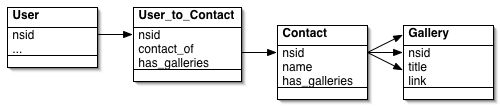
By contrast, in the datastore, Both FlickrUser and Gallery objects have a contact_of ListProperty. As a new user's contact list is examined, their NSID is added to the contact_of list. This is how the pages showing galleries for a contact are built: it's a simple equality test, which is translated behind the scenes to a list-membership test:
galleries = Gallery.all().filter('contact_of =', nsid).fetch(256)
 It took a lot of fiddling to break out of the ORM/SQL mindset, based on joins, but I think I'm happier now I have. On the other hand, keeping the contact_of lists on all the objects in sync is something of an overhead, and the query code isn't significantly easier. There's also a rather severe limitation I only ran across later.
Onto the Flickr blog
This was all well and good as I let a few other people at the site; initially close friends, then via a couple of screenshots on Flickr, before inviting a bit more of a burst of users via Twitter. The site seemed to be scaling fine; there was a lot of CPU used fetching contacts, which eventually I managed to optimise by being more selective about updating from the gallery feeds.⁴ In fact, the FlickrUser object is currently pretty much a stub, although I'm thinking of changing that.
However, when docent made the Flickr blog, it hit a serious issue: exploding indexes. The version of the app that was live was doing this query:
galleries = Gallery.all().filter('contact_of =', nsid)
                         .order_by('-published')
                         .fetch(offset, per_page)
That extra "order_by" criteria required an additional index, and because it's combined with a ListProperty (namely contact_of), it hit the problem documented in the Queries and Indexes page:
Custom indexes that refer to multiple properties with multiple values can get very large with only a few values. To completely record such properties, the index table must include a row for every permutation of the values of every property for the index.
When I last looked, docent knew about 14,000 or so galleries. While most had small contact_of lists, some no doubt expanded to dozens of people, and so the index was too large to store. As a workaround, I eventually realised I had to abandon sorting in the query and instead use Python, at which point the app started being responsive again. Lesson learnt, the hard way.
Moving On
So, what now? The app is up, and although there are a few errors still happening, they're mainly in background tasks that can be optimised and retried without any impact on users. Personally, it's been a fairly good, if occasionally intense, introduction to App Engine's unique features.
Would I do things this way again in future? I'm not sure. Turning the relationship model on its head hasn't led to an obvious improvement over the ORM+SQL methods I'd use in, say, Django, and while the Task Queue API is very easy to use, it's hard to develop with (since it has to be fired manually locally) and there are other job queue solutions (such as Delayed Job, for Rails, as used on Heroku). On the other hand, even with the heavy load, and not the best of optimisations, docent almost stayed within the App Engine free quota CPU limits⁵, and didn't approach any of the others.
In any case, I'm happy to have produced something so useful, and hope that anyone who tried using it yesterday only to run into errors feels willing to try again. In the meantime, I'm sure there'll be more scaling roadbumps as the site gains users and more galleries are added, but I'm looking forward to fixing them too. Please, try docent out.
(I know comments aren't enabled on this site at the moment. Feel free to add them on docent's page on Flickr's App Garden.)
¹ Why "docent"? Originlly it was the unwieldy gallery-attendant, but Chris suggested the name, based on a term more common in the US than here for the guide to a museum or gallery. ↩
² NSIDs feel like the primary key for Flickr users: in methods like flickr.people.getInfo, it's one of the key pieces of returned information, and it can be used in feeds to fetch information as well as URLs to photos and profile pages.↩
³ Using feeds rather than API calls can be handy. For one thing, they don't count against your API queries-per-second count; hopefully they're cached more aggressively, both via the feedparser library and on Flickr's side so they take less resources.↩
⁴ One nice thing about getting more users is that the likelihood of finding a contact's galleries in the data store already goes up. When I was developing, I had to fetch everything; for the second user, there was some overlap, saving calls. As the site gets bigger, the number of fresh gallery fetches should keep fairly low.↩
⁵ Since I last wrote about App Engine, it's grown the ability for users to pay for resources beyond the free quota levels. I decided to do this when I hit about 55% of my CPU quota, and the app did indeed reach about 120% yesterday. I don't have a bill yet but I expect it to be under $0.50, which is fine.↩
2009-06-29
Olympus PEN E-P1: A Hands On Review
Introduction
The big digital photography news this month has undoubtedly been the launch of the Olympus PEN E-P1. If you're not the sort of person who checks sites like DPReview (where the PEN has taken top place in "most popular cameras"), the E-P1 is a rather strange, interesting new camera. Using a system called Micro Four Thirds, it offers interchangable lenses, a relatively large sensor, and by abandoning the mirror and pentaprism of a true SLR in favour of "live view" technology, a compact body. I was lucky enough to have the chance to spend a few hours playing with one over the weekend, and here's what I thought.
There's been a small but vocal section of the photography community wanting a small, well-specified, prime-lensed camera for years. Mike Johnston's classic Decisive Moment Digital post set out what he wanted in a digital camera, and why the traditional compacts and SLRs failed to satisfy. For the last few years, people have tried the Ricoh GR-D cameras, the Panasonic LX-2 and LX-3 (and their Leica rebadgings), Sigma's DP1 and DP2, and all had been found lacking. When Olympus unveiled their prototype last year, people hoped their desires might soon be met.
 So, how does the E-P1 actually hold up? Sadly, the final design isn't quite as nice as the prototype, but the addition of the grip bulge on the right hand side works well. Physically, it's about half the volume of my Canon 450D (XSi), and about 50% larger than my Fuji F-30 (although the prime lens, as you'd expect, protrudes less). The silver colouring makes it look somewhat consumer-centric; an all-black version would definitely be nice.
Olympus have delivered both "pancake"¹ (17mm f/2.8, 34mm equivalent) and zoom (14-45mm) lenses at launch, with adaptors for both Leica M and full-size Four Thirds mounts (which I didn't get to play with). I'm pleased to see the choice of a wide lens, since the 2x crop factor² means what are standard lenses for film are zoom lenses for the Pen. The UK has bundles with body-only, either kit lens, and finally one with both lenses, although bafflingly, this mixes the colours (what on earth is the thinking there?).
In use
In the hand, the camera is nice and dense; apparently it's made of metal, and certainly feels that way. The one I was using had a neck strap which was quite thin, hung too low, and is apparently a fairly expensive extra; perhaps Olympus have taken the retro thing too far. Of course, as there's no mirror, you compose your image on a screen. The lack of mirror also makes the shutter silent, which is a nice change from an SLR.
The screen was certainly bright enough on a cloudy London evening, but I'm not sure how it would be in direct summer daylight. There is an optional viewfinder, but that's fixed for the 17mm, and I didn't have it during my walkabout. I did try it quickly in Jessops on Thursday, and framing seemed correct, but of course it won't show depth of field or a focussing preview.
Speaking of focussing, it's handled nicely, considering the lack of a direct light path; using the focus ring on the lens causes the live view to flip to a 1:1 pixel view of the centre, which seemed to be perfectly usable when I tried it. Generally autofocus was reliable, but towards the end of the walk (at past 9pm, under cloud) there was a bit of focus seeking with the zoom lens. Speaking of that lens, it has a neat feature, letting it collapse up for storage. I think that both lenses have the same lens cap diameter, but differing filter threads: the prime is 37mm, the zoom 40.5mm.
Naturally, the Pen has an orientation sensor (one of those features that tends to be forgotten by reviewers, but which can be annoying when absent), but it also has a view mode where there are two on-screen level meters, which is handy for architectural shots. In fact, there are a wide range of display overlays, including a grid, a rule of thirds view, a live histogram, and a multiple-shot view. Unfortunately I forgot to take a picture of this in action, but it seemed to work well.
The screen doesn't fold out (something that until recently was confined to compacts, but which has spread to SLRs), but it is visible from fairly wide angles (I held it above my head and was able to make out enough to frame pictures). There's the now-obligatory video mode, which offers HD (at 1280x720, not the larger 1080 size), and it seemed fine, even in lowish light. (I didn't get to take one of my usual "train entering the station" videos, but I did get some on an escalator.)
Speaking of low light, the Pen can be pushed to ISO 6400. I tried this on a couple of shots inside a restaurant (with dim, reddish lighting), and while the grain is very noticeable at full size, scaled for the web (or even full screen), the image is completely usable, with a grain-like quality, if anything. Combined with the relatively wide f/2.8 on the prime lens, I'd say low light performance would be considered good by anyone who's not used to a modern DSLR.
A drawback that's plagued digital cameras since their invention, shutter lag, is unfortunately also a problem for the E-P1. I first noticed this when trying to take video; I'd see a cyclist under the Queen Elizabeth Hall start moving, and click the shutter, but it would take a good second or two to start up, missing the action. I tried a few other times to take still photos while walking and the problem was the same in that mode. Perhaps it was due to focussing time, since it was perfectly fast in continuous shooting, and I could have been asking too much, but I'm sure it's slower than I'm used to from my Canon SLR.
More minor, but perhaps also noteworthy, is the fact the combination of the prime lens's maximum aperture of f/2.8 and the 2x crop factor mean that getting narrow depth of field is a little trickier than it would be at full-frame (or even a 1.6x crop with a f/1.4 lens). Having said that, there's some nice depth of field on this portrait (which I didn't take). One final niggle: the picture review seemed a bit slow to come up. If you don't chimp, you won't care.
To be fair, neither of these were serious issues in most of the shots I was taking, since I usually shoot buildings, details, signs, and other things that don't move, and I suspect a bit more time on my part to think about how to roll with the camera would have made even more difference. Still, they definitely need to be mentioned.
I've posted a set of images and videos, with original size available, on Flickr. I'm not a pixel-peeper, and at web resolution they seem nice; definitely better than I'd expect from the F30, and probably about on a par with the 450D.
Conclusions
I'm very happy to see this camera come to market. There's definitely room for a compact yet professional-quality camera, and this is probably the closest I've seen to being the DMD. Unfortunately, the last few years have seen the prices on digital SLRs built around the mirror/pentaprism drop so far as to squeeze this part of the market; who'll pay £700 for a body and kit lens when you can buy a Sony or Nikon for half that?³ On the other hand, it's a heck of a lot cheaper than digital rangefinders, which it can also claim to compete against.
Hopefully some people will look past the sticker and realise that this is something interesting. Would I recommend it? If you're looking for something pocketable but powerful, don't mind not running with the mainstream, and can justify the expense, then I'd say its unique abilities definitely make it worth serious consideration. That said, I doubt I'll get one myself. Maybe the next version?
The Good:
- Solid, sturdy feel
- Picture quality at SLR standard
- Sane menu structure
- Low-light performance seemed good (although some focus seeking)
- Olympus are genuinely trying something new
The Bad:
- Shutter lag
- Price - it'll have its work cut out making room in the market
- Limited choice of lenses (but then, it is just launched)
The Ugly:
- No black model - choice of white+cream or silver+black
- The bundling of randomly coloured lenses
Thanks to Ghene Snowdon for fixing it for me to have the chance to play with the camera. (Ghene's pretty active on London Flickr Meetups; it's worth paying attention there, as I know friends who've got to try out cameras there for various reasons before.)
¹ A pancake lens is a very thin prime (ie fixed focal length) lens, named for the fact it's as thin as a pancake.↩
² The "crop factor" is the ratio between the focal length needed for the sensor and the focal length for 35mm film. This means that, to get the same field of view as a 50mm film SLR lens would provide, the Olympus needs a 25mm lens, while my Canon SLR requires 32mm.↩
³ Hopefully the next few weeks will see the street price drop a little. Canon's 450D dropped from £650 to £500 over the first three months it was on the market.↩
2009-06-09
Quick thoughts on iPhone 3GS
Well, I'm sold.
I've owned an iPod touch for eighteen months. At the time I didn't want to take a punt on the just-released iPhone, but in the intervening time the launch of the 3G hardware made me consider buying one. I'm disorganised, though, and when it got to April I decided to hold off, suspecting the hardware would be refreshed in June.
Of course, it has, and I'll soon be getting in touch with O2 to pre-order My First iPhone. I'm undecided on whether it's worth spending the extra for the 32GB model, but I probably will. The camera improvements (autofocus, slightly higher resolution, and video) are nice; I'm enough of a fanboy to cheer the compass (Google's Sky Map would be lovely), and of course it'll be nice to have a faster device. (Will games throttle their speed on the new hardware, I wonder?)
Existing owners of iPhones are a bit peeved, though. Unlike the last time there was an upgrade, O2 aren't doing anything to let people upgrade early, and operators everywhere seem keen to annoy people who want tethering, either by not offering it or overpricing it. Personally, I'm not that bothered. I know going in there's almost certainly going to be six months in late 2010 when I don't have the latest and greatest, and I dare say I'll cope. (As Matt Jones put it on Twitter, "if you like the shiny, don't be whiny.") A price cut in the UK would have been nice, but I suppose O2 don't feel they need it. Maybe if exclusivity ends?
(I also wonder if the loudest complainers are the same people who are used to upgrading their laptops with every speed bump? That's not a group I've ever been part of; instead, I aim to make my machines last at least their three years of AppleCare. Perhaps the first group are just more vocal, or more used to being able to buy what they want? Of course, iPhones aren't computers, but I assume people think of them as more like computers than phones.)
There is a subset of those vocal complainers who may have a point- developers. The iPhone platform now has devices that run the gamut from the first generation touch, which has no camera, Bluetooth, or support for microphones, to the iPhone 3GS, which has al of the above built in, plus the improvements noted above. The speed range is getting quite large too, and I can understand the desire of devs to get cheaper access to various bits of hardware.
For now, the best bet - outside of large companies - seems to be to find people to test things, but that's hardly the best approach. On the other hand, expecting Apple to duplicate Google's I/O stunt - handing out free phones to every attendee - wasn't likely either. I also wonder if Apple are expecting that developers will just use the emulator?
Still, for all the complaints - largely unjustified, as we all know telcos are like that - this is a perfectly good incremental update. As Steven Levy says, "It's not a game changer." It doesn't need to be, though, and I'm sure it'll do well.
2009-04-27
More on iPhoto '09 and Flickr
A couple of months ago, I posted some first thoughts on iPhoto '09 and its Flickr integration. Despite the fact that it's not amenable to scripting, I liked the idea of having photos be editable in either iPhoto or Flickr that I kept using the native support to upload photos.
Of course, as Fraser Speirs said, "iPhoto '09 really, really wants to make photosets for you." So how to upload a few images? Well, dragging an image adds it to a set, and as you'd hope, dragging images to an iPhoto set starts an upload going. However, there's a huge annoyance here: to get ordering in your photostream, you have to drop the images in one by one. (Flickr sets can be ordered post-upload, but you can't reorder your photostream¹.)
Generally, the syncing of metadata has been great- when I've changed a location (or even photo) it's worked fine. However, it's also been worryingly fragile. I think I've had issues about once a fortnight with an upload failing (either because of a temporary issue with Flickr, or network congestion, or just someone sneezing down the road). iPhoto then gets into a confused state. You can't abort the sync and quit; eventually it'll either crash of its own accord, or I'll get fed up and force quit. Upon restarting, I find it's forgotten which photos existed in the set, so it downloads the originals from Flickr and breaks the connection. Either that, or it just gives up.
At least the worst-case has never happened: iPhoto has never deleted a photo from Flickr without me asking it to explicitly. (I'd "only" lose comments and group metadata, but that's quite enough, thanks.)
Edit: Of course, just after publishing iPhoto did just that: it lost a week of photos that I'd posted via its uploader. I'm more or less able to recreate them, I think, but I've left broken links and dropped favourites. I hate to have done that to people. (For what it's worth, I think I'm somewhat to blame. See, when iPhoto gets confused, it'll delete its connection, and then restore the image by downloading it from Flickr. However, this evening, before it had finished, I deleted the "images" (actually placeholders). I'm sure that in the past, both iPhoto and myself have done this and both the Flickr and local copies have stayed intact. Today, the Flickr copies were removed.)
So, what now? I could hope that a point release of iPhoto makes it more reliable, but to be honest, I feel like this is actually a Really Hard Problem, and I can imagine that Apple care more about Facebook. Anyway, 8.0.2 doesn't seem to have made the slightest bit of difference, and now I've given up on the whole experiment and reverted to using Flickr Export.
Of course, that don't offer two-way sync either, because previous versions of iPhoto didn't have anywhere to store the metadata, and the current version doesn't document how to². Aperture does have a more expressive API, so Flickr Export for that app does offer syncing (although I suspect not back-filling), and I have other reasons to consider an upgrade (not least, how to handle libraries of RAW files that easily fill a laptop hard drive).
Still, it feels like a lost opportunity. Ah well.
¹ Actually, not quite true: you can fiddle with the "date uploaded" field, but only in the Organizer. It's not exactly drag and drop. Usually I'm fine with that, but then, I'm used to apps that behave themselves. ↩
² Apparently F-Script and PyObjC (and presumably, somehow, ObjC itself) allow you to inspect running apps, so at some point I need to figure out how to use one or more of them to inspect the blobs that I discovered were stored in the SQLite database for Flickr syncing. ↩
2009-04-06
How to use Daytum
Daytum, the personal information tracking site by Ryan Case and Nicholas Feltron, came out of beta just this weekend. I've been using it (on and off) for a while, and a couple of weeks ago I wondered on Twitter if it was just me that couldn't wrap his head around how to use the site. Someone (who's private, so gets to remain nameless) pointed out that there was evidence that I wasn't.
Nonetheless, I'm not the sort to just give up, so I spent a good half an hour poking at the corners of the interface, and I think I've figured out a couple of fairly important, but somehow hidden, UI elements that I think will make the site easier to use for some.
This example will show you how to set up a "miles run" counter, how to backfill data, and introduce you to how to display that data.
First, get a Daytum account, log in, and then "edit your data sets". Create a new counter:

Once you've done that, you'll be presented with a nicely laid out form. Add an appropriate name (the public will never see this), then you'll be prompted to add your first item.

![]()
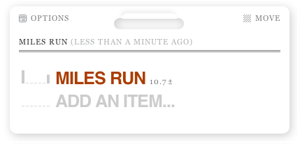
This item will show up in the user interface, so pick its name well. For our purposes, the only thing this counter is tracking is miles run, so "Miles Run" is an obvious name. As you add the item, you'll see the interface now ask for an amount.
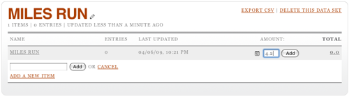
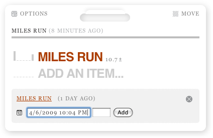
I'm adding 4.2 miles run. Click Add and the total will be update to reflect this. But I didn't just run 4.2 miles; I did that yesterday afternoon. To edit the date, you have to click on the total, then on the pencil icon that appears when you hover over the row that's revealed. This opens up a date editing widget. (Note it's always in US date format. Oh well.)
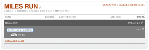
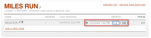
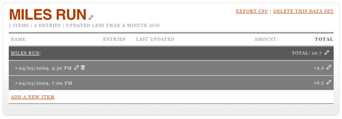
You can also edit the amount by, again, clicking on the pencil at the other end of the row. It turns out that it's possible to set the date and time when adding a row, too: click on the little calendar icon (it says "12" on it) before you submit your amount. This will let you see two rows when you click on the total.
So, now you're adding data happily every time you run, but nobody in the world can see this. For that, you need to go back to your home page on Daytum and add a display.
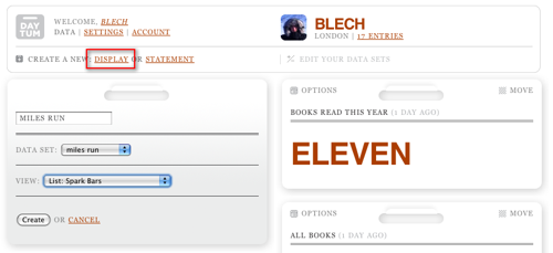
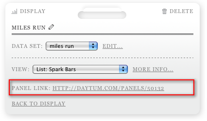
Note that this is where that "data set" name that nobody else sees is used: it ties a display to an underlying counter. You can also play around with different visualisation options; I'm partial to "Spark Bars" but you might prefer something else.
Hey presto, there's your progress. Or, in the case of my completely artificial data, lack of it. However, there's a nice trick here: the ± icon next to the total can be clicked on to allow you to add data directly from the display. You'll also note the same calendar icon, allowing you to back (or forward) date entries.
There's one final trick to mention. Once a display's been set up, click on "Options" at the top left and you can get a link direct to that panel.
Hopefully this has helped someone else who was a bit confused cut to the heart of the Daytum site.
2009-03-16
Thoughts From the Open Platform
Last November, I was lucky enough to get an invite to the Guardian's first hack day, which commenced with signing an NDA for their forthcoming API. Last Tuesday, I got up early to go to the shiny new Kings Place offices to see the Open Platform launch, and there were three things I wanted to post about it.
The first has been well covered: how open it is. I was initially hesitant about this too, but unlike the sites that have launched APIs until now, which are largely built on user-generated content (for once, the phrase actually fits), the Guardian's opening up content which it's sold rather than given away for nearly two hundred years.
Meanwhile, Winer raises the question "You gotta wonder if when they get out of beta their competitors will be able to repurpose their content. My guess is not" when that was the first question raised in the launch Q&A (and it's been reported since, not least on Roo Reynold's excellent writeup); it was answered (more or less) with a yes. The situation isn't ideal, and I still don't have an API key, but it's a very different beast from an service whose goals include backing up your own content. For now, I'll forgive them.
The second was on the subject of the Data Store, the Guardian's curated selection of "facts you can use", as the title puts it. The spreadsheets are hosted on Google Docs, but to edit them online you have to export them as Excel and then reimport them.
This seems incredible to me now, having been exposed to the joy of GitHub and its easy forking. Why not allow people to spawn editable copies of a spreadsheet, directly linked back to an authoritative source, keeping their own views (including visualisations)? Admittedly, this is a project more for Google (or a competitor to them) than the Guardian, but it'd be great.
(As a side note, I found the post by Simon Dickson on Data Store quite interesting. I did once spend some time grappling with ONS spreadsheets, and found them quite hard to work with. Unfortunately, a quick look at the Guardian's selection shows some of the same problems - heading rows that interfere with columns, for example. Again, a forking model would allow the emergence of semi-canonical clean data sets, which would be great.)
The final point was even more tangentially linked to the Guardian's APIs, but it did spring to mind in discussions (with, I think, Gavin Bell in the immediate aftermath). It arose after talking about the demo Chris Thorpe wrote for the launch, Content Tagger, which combines the Guardian's tags with those in Freebase's ontology and the hive mind's tags from delicious.
As Chris says in his writeup (which is well worth reading), "Tom Coates' vision of the Age of Point-at-Things is fast becoming the age of point at resources and link them all together," and what seems to be linking things together more and more often is the tag.
More specifically, machine tags are foreign keys. (Well, they can be other things, too. But they're very good at that in particular.) For example, I can imagine a script that adds tags to delicious based on the Guardian's tags for their own stories, but prefixed with "guardian:" or "guardian:tag=" so that they don't clutter my tags. Similarly, snaptrip links Flickr to Dopplr, like the popular lastfm: and upcoming: machine tags, while the recently-launched Friends on Flickr Facebook app uses, guess what, facebook:user= machine tags.
Content Tagger doesn't directly use machine tags that way, but it struck me that it might be a useful way to think about them in the future.
In any case, it was a privilege to attend the launch, and I'm happy to have had a few thoughts spurred by it.
2009-02-26
The Impossibility Of Ticketing
BarCamp London 6 is in a month or so, and everyone's trying to get a ticket. Well, so it seems, anyway. Two batches have so far been released, and both have been allocated within a minute. It's so ridiculous, I don't even think I can be bothered trying.
I've complained about this sort of thing before, way back when, on the 2lmc spool, when that was extant. Even then, rather than just grousing, I had a suggestion.
Given the current ticket allocation system is a lottery, why not, well, make it a fair one? Rather than giving tickets based on who can hit "reload" in a browser fastest, leave the ticket system open for as long as the current wave system lasts (well over a week, so far), and let everyone apply for a ticket. Then, close the system, and randomly allocate the number of tickets available to the list.
This seems to me to be a far fairer solution. Of course, there are other ways of doing this. A nominal fee - something like the £12 charged by Ruby Manor, or the £20 for Interesting - would also have the effect of trimming the entrance list, and it might stop some of the encroaching commercialisation of the event. (Anyway, does every BarCamp really need its own tshirt?)
After I ranted about this in the pub, Gavin Bell suggested another model, an invite network, under the name seed16. In the comments on that piece, Simon Wistow suggested that, if going with friends is important, you could let people apply for tickets en masse, and vary the lottery model in different ways.
I'm sure the BarCamp people have a lot of work to do in getting their conference running, and having organised a few events for london.pm way back when, I know it's easy to criticise. I do think that ticketing has become something of a farce, though, and it's got to be worth considering different approaches.